


November 18, 2024
When it comes to branding, few elements are as powerful or as overlooked as color. Colors shape perceptions, evoke emotions, and even influence purchasing decisions, making them a crucial tool for any brand looking to stand out. Whether you’re crafting a wellness brand, a coaching business, or a creative agency, understanding the psychology behind colors can help you create an identity that resonates with your audience and enhances your brand’s impact.
In this blog, we’ll explore how to use colors effectively to influence brand perception, covering some practical tips and insights into color psychology to help you make strategic choices for your brand.
1. Understanding Color Psychology
Color psychology is the study of how colors impact behavior and perception. Different colors can evoke various emotional responses, and knowing what these associations are can help you select colors that align with your brand’s message and values. Here are some commonly understood associations in color psychology:
- Red: Associated with passion, energy, and urgency. It’s an eye-catching color that can create a sense of excitement.
- Blue: Often symbolizes trust, reliability, and calmness. It’s a popular choice for brands that want to convey professionalism and stability.
- Green: Linked with health, nature, and tranquility. Green is common in wellness, eco-friendly, and financial brands because it feels grounded and nurturing.
- Yellow: Represents optimism, happiness, and warmth. It’s attention-grabbing and can make a brand feel friendly and approachable.
- Purple: Associated with creativity, luxury, and wisdom. Purple is often used by brands that want to convey a sense of sophistication and imagination.
- Black: Represents elegance, power, and sophistication. Black can make a brand feel luxurious and authoritative, particularly when combined with gold or white.
These color associations aren’t universal, and cultural contexts can influence interpretations, so it’s essential to consider your target audience when choosing colors.
2. Align Colors with Your Brand Personality
Your brand’s personality is the set of human characteristics attributed to your brand, like being friendly, sophisticated, or innovative. Choosing colors that reflect this personality helps create a cohesive, memorable brand.
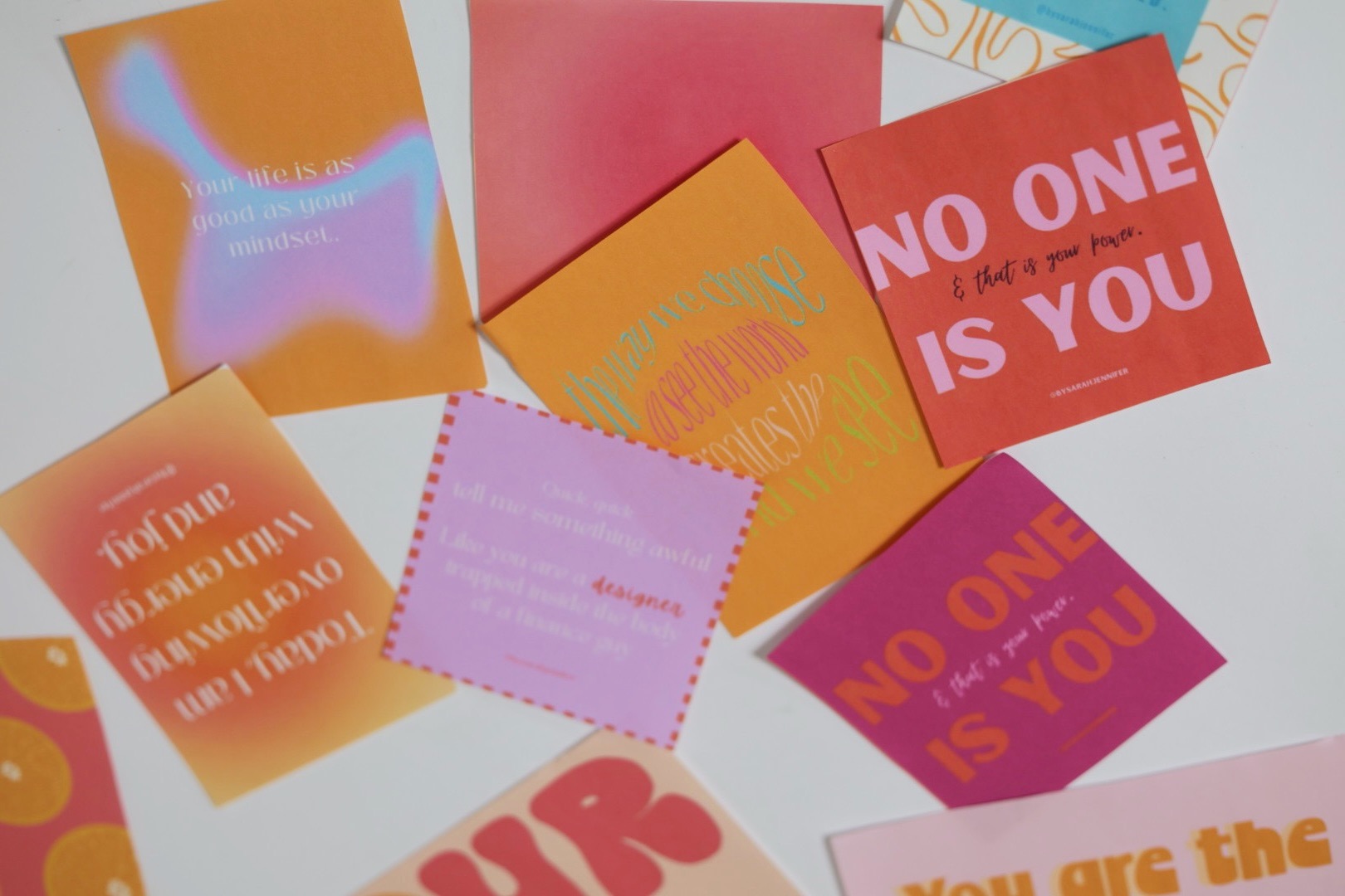
- Playful Brands: For a fun, approachable feel, consider bright, cheerful colors like orange, yellow, and pink. These colors are great for brands in the lifestyle, beauty, and wellness sectors that want to feel fresh and inviting.
- Professional Brands: If you want to convey authority and trust, like many businesses in the financial or corporate space, go for cooler tones like blue or gray, which create a sense of dependability.
- Sophisticated Brands: For luxury or high-end brands, muted tones like deep purples, black, and gold give a refined and premium look. This can work well for wellness brands targeting a more affluent clientele or creative services with a high-end positioning.
3. Use Color to Evoke Desired Emotions
Emotions play a huge role in consumer decision-making, so using color strategically to evoke specific feelings can enhance your brand’s effectiveness.
For example:
- A wellness or meditation brand might lean into soft, calming colors like lavender, pale blue, or sage green, helping clients feel relaxed and at ease.
- A motivational coach could opt for energetic, uplifting colors like bright orange or yellow to inspire positivity and drive.
- A creative agency could blend sophisticated neutrals with a pop of a bold color like teal or magenta to signify both professionalism and creativity.
By aligning your color palette with the emotions you want clients to feel, you create a more immersive and impactful experience.
4. Create Brand Consistency with a Cohesive Color Palette
A cohesive color palette strengthens brand recognition and provides consistency across various touch. points. For a well-rounded brand color palette, consider the following components:
- Primary Color: The main color that reflects your brand’s core values and personality. It should appear most prominently in your branding materials.
- Secondary Colors: These support the primary color and add variety. Use them for accents, backgrounds, or to differentiate sections in your design.
- Accent Colors: These are typically used sparingly to draw attention to specific elements, like calls-to-action (CTAs). Accent colors are great for adding a contrasting, attention-grabbing touch.
When choosing these colors, test how they look together to ensure they harmonize and visually represent your brand identity.
5. Consider Contrast for Accessibility
A visually appealing color palette isn’t just about aesthetics; it’s also about accessibility. Many people experience some form of color blindness or visual impairment, so incorporating contrast is essential for readability. This is especially important for text on your website or in marketing materials.
When designing with contrast in mind:
- Choose text colors that stand out clearly against the background. For example, dark blue text on a white background is generally more readable than light yellow on white.
- Ensure your call-to-action buttons are highly visible. A contrasting color for CTAs will make them more eye-catching, increasing the chances of engagement.
Color is Powerful
Colors are more than just an aesthetic choice—they’re a powerful tool that influences how people perceive and connect with your brand. By understanding the psychology of colors and using them intentionally, you can craft a brand experience that is not only visually appealing but also emotionally engaging.
Remember, the key to choosing the right colors is alignment with your brand’s values, personality, and audience preferences. So, get creative, test your palette, and watch as your colors help your brand make a memorable and meaningful impression!
Wellness/Lifestyle Favs
I am a wellness/holistic health girly at heart. I love getting new lifestyle/wellness product recommendations and so I wanted to have a place for my own. These are the products I love and trust in my own daily routines, and I can't wait for you to explore them too!
Natural Cycles
the oura ring
bodybio electrolytes
Ritual Moringa oil
lush Magnesium sleep bar


Use my link for 20% off an annual subscription!
Use my link for $40 off an Oura Ring!
*Some of the links below are affiliate links, which means I may earn a small commission if you make a purchase through them, at no extra cost to you. Rest assured, I will only recommend products that I genuinely love and believe will add value to your wellness journey.
Hypochlorous Acid Face and Skin Spray

Nordic Naturals Ultimate Omega

Kindle

Use code SARAH for 10% off!

